A visual language, beyond an effect
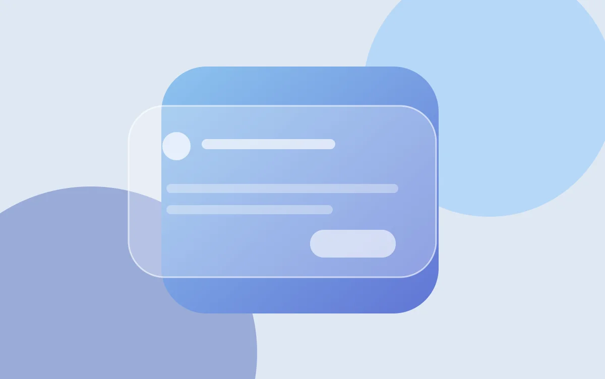
At its June 9, 2025 presentation, Apple described Liquid Glass as a translucent visual material for its interfaces. The design covers controls and navigation and was introduced with iOS 26 and other Apple platforms. This article revisits that announcement; it does not describe iOS 26 as today’s latest release.
Our perspective: start with the task
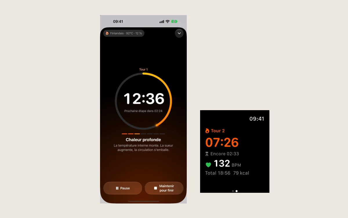
For an app, we prefer to begin with a simple question: what is someone here to do? Starting a timer, finding a note and understanding a measurement call for different choices. A visual treatment earns its place when it supports that task.
This is our interpretation of the design direction, rather than a rule announced by Apple. Before adding effects to an interface, these are the checks we would want to make:
- Read labels against backgrounds that are both plain and busy.
- Find the main action with one hand.
- Increase text size and check that controls remain visible.
- Navigate with VoiceOver without relying on decoration.
Test readability before judging style
A screenshot captures a moment. An interface is judged during a task. Repeat the same journey before and after a change: where do you look for the button? Which information do you read twice? When do you hesitate?
We suggest recording those difficulties before choosing visual effects. It makes the discussion more concrete than a verdict on appearance alone.
For the apps you use
An app does not need to make you notice every transition to feel pleasant. After an update, look first at whether familiar actions remain simple and text remains comfortable to read. The best detail is often the one that lets you get on with things.